 It Works Locally
Setting Up Visual Studio Code for Dyslexia
I hid my dyslexia for a long time. First because I was afraid it meant I was stupid, then after diagnosis because I was afraid of what people would assume. I am now in an environment where I can be open about it — and where being a screen reader user is seen as an asset, because I can see accessibility issues that others miss.
One thing that changed when I stopped hiding it was setting up my tools properly, rather than tolerating defaults that made everything harder than it needed to be.
This is my current Visual Studio Code setup. None of it is complicated, but it made a difference.
Font
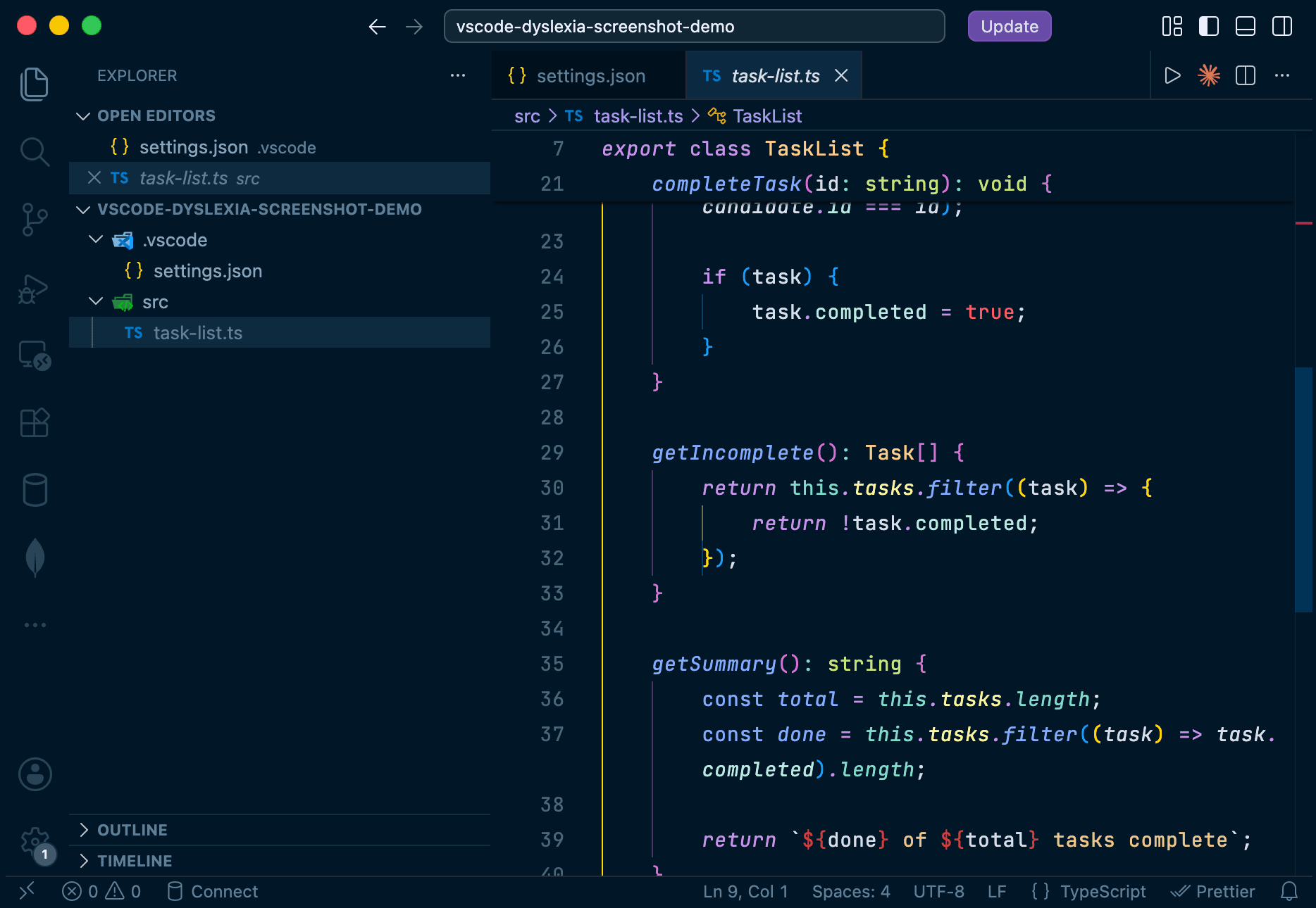
The most impactful change is the font. I use JetBrains Mono, available free from Google Fonts. It was designed with readability in mind — the letterforms are distinct, which helps with character confusion, and it is a monospace font so spacing is consistent.
Installing it takes two steps: getting the font onto your system, then telling VS Code to use it.
On macOS:
- Download the font from Google Fonts
- Open Font Book
- Go to File > Add Fonts to Current User (or press Cmd+O)
- Open the folder containing the downloaded font
On Windows:
- Download the font from Google Fonts
- Extract the
.zipfile if it downloads compressed - Right-click the font file and select Install
Then add it to your settings. Open the Command Palette (Cmd+Shift+P on macOS, Ctrl+Shift+P on Windows), run Preferences: Open User Settings (JSON), and add:
"editor.fontFamily": "'JetBrains Mono', monospace",
"editor.fontSize": 14,
"editor.lineHeight": 1.8,
"editor.letterSpacing": 0.5,
"editor.fontLigatures": false,The lineHeight and letterSpacing values give characters extra space, which reduces the visual crowding that makes dense code harder to read. Disabling fontLigatures keeps characters separate — ligatures combine character pairs into single glyphs, which can make individual characters harder to distinguish.
Cursor
The default cursor in Visual Studio Code is a thin blinking line. For anyone who loses their place easily, it is not ideal.
A block cursor is easier to spot, and disabling the blink removes a source of distraction:
"editor.cursorBlinking": "solid",
"editor.cursorStyle": "block",I also changed the cursor colour to pink, which matches the colour used across my site and works well against the Night Owl theme:
"workbench.colorCustomizations": {
    "editorCursor.foreground": "#cb2d6f",
    "terminalCursor.foreground": "#cb2d6f",
},Visual clarity
A few settings that quieten the interface and make tracking easier:
"editor.wordWrap": "on",
"editor.minimap.enabled": false,
"editor.renderLineHighlight": "all",
"editor.bracketPairColorization.enabled": true,
"editor.smoothScrolling": true,wordWrapavoids horizontal scrolling, which breaks reading flow- Disabling the minimap removes a panel that adds visual complexity without much practical benefit
renderLineHighlighthighlights the full current line, so you can always see where you are- Bracket pair colourisation uses colour to match opening and closing brackets, which makes nested code easier to read
- Smooth scrolling reduces the disorientation that can come from jumping through a file
Navigation
Two settings that make orientation easier:
"editor.stickyScroll.enabled": true,
"breadcrumbs.enabled": true,Sticky scroll keeps the current function or block header visible as you scroll through a file, so you always know where you are. Breadcrumbs show your position in the file structure at the top of the editor.
Theme
I use Night Owl by Sarah Drasner. High contrast themes can ease visual stress — the distinction between code elements is clearer, and there is less strain over a long session.
Night Owl also has a light mode variant if you prefer a light background. The accessibility benefit is the contrast, not the darkness.
Extensions
Two extensions worth highlighting for dyslexia specifically:
Code Spell Checker — this was the first extension I installed, years before Visual Studio Code had built-in variable tracking. A recurring problem was misnaming variables — initialising one with a correctly spelt name and then referencing it later with a different spelling, or the other way round. The spell checker caught those mismatches early. Visual Studio Code now highlights unused or uninitialised variables natively, but the extension still catches spelling errors in comments, strings, and documentation.
GitLens — not strictly an accessibility tool, but it shows extra context inline, so there is less to hold in working memory while navigating a codebase.
If you are a developer with dyslexia and you have been tolerating the defaults, it is worth an hour to set things up properly. The difference is real.